View Results
Analyze your assessment results to gain insights into your climate risk evaluation and understand the implications for your assets.
Map View
The starting point of each assessment is the Map View screen, which shows dots for each asset run in the assessment, color coded by Loss Ratio (Asset Analysis Tier) or Risk Score (Hazard Only Tier).
This allows for a quick and easy way to identify which assets are at higher risk.

Location List
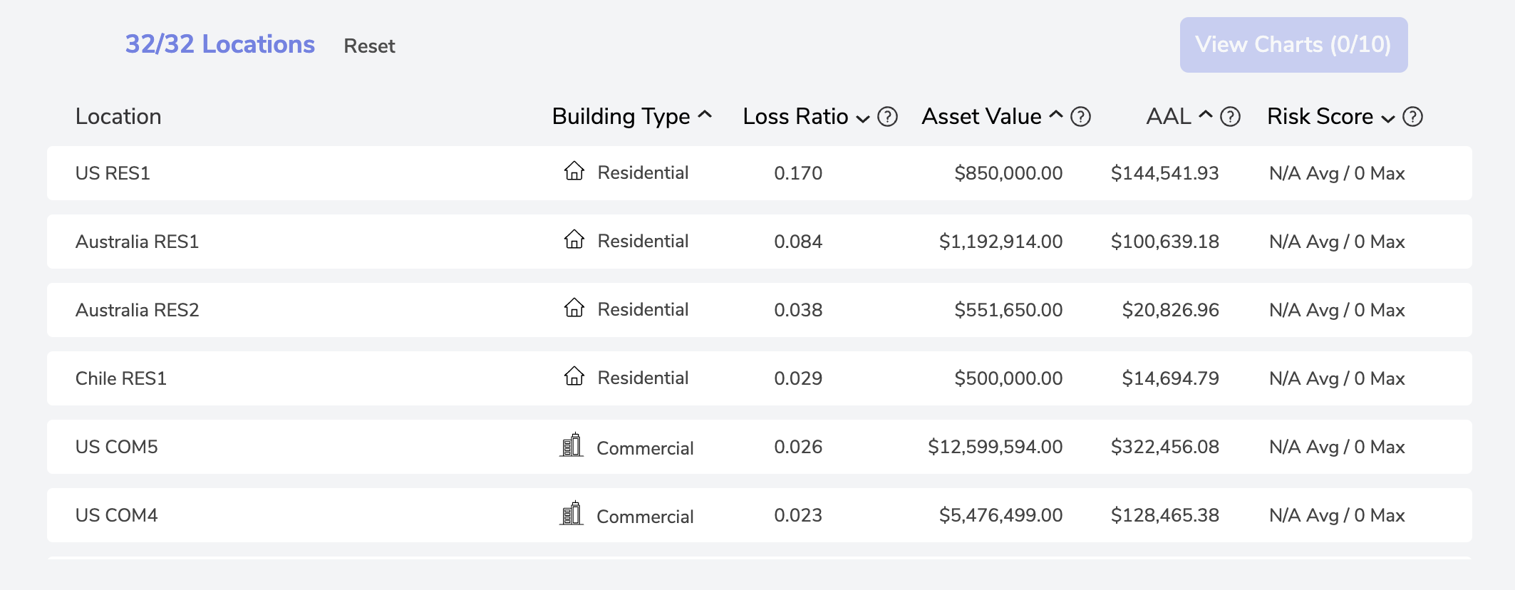
The table below the Map View displays all the locations in the assessment and allows users to sort by Building Type, Loss Ratio, Asset Value, Average Annual Loss, or Risk Score.

Note: For larger assessments, it is often useful to sort locations by Loss Ratio, Average Annual Loss, or Risk Score to prioritize the locations with highest risk for further analysis.
Hazard Only Tiers: Building Type, Asset Value, and Risk Score included
Asset Analysis Tiers: Building Type, Loss Ratio, Asset Value, Average Annual Loss (AAL), and Risk Score included
Filtering Location List
To refine the Location List and focus on specific assets for analysis, Aegis provides several methods:
- Click on individual dots on the map to isolate a location
- Use the Box Selector tool at the bottom right of the map to select multiple locations
- Choose locations directly from the Location List
- Utilize the Map Filter dropdown for more detailed filtering options
- Filter based on Climate Scenario, Time Period, and Climate Peril(s) from the Navigation Bar above the Map
Detailed Chart Analysis
Select up to 10 Locations at a time and click the View Charts icon at the top right of the Locations List to access detailed charts and visualization for more in-depth analysis of your assets.
*See Metrics & Charts Documentation for further information
Need More Help?
If you have further questions regarding viewing your assessment results, please send us an email at support@dclimate.net.
Also, feel free to submit a question using the 'Have a Question?' button located at the bottom right of the screen on Aegis.