Metrics & Charts
Visualize and analyze your data with comprehensive metrics and interactive charts.
Metrics
Average Annual Loss (AAL) is a key financial metric calculated by Aegis, representing the average projected yearly financial loss over the time period and climate scenario being assessed.
-
The AAL measures the projected average annual loss due to climate-related events, expressed in today's dollars, focusing on structural damage to the building.
-
The AAL estimate is dependent on:
-
- Hazard Model: predicts the magnitude and frequency of events based on the climate scenario and time period.
-
-
Vulnerability Model: assesses the damage to the asset based on projected event magnitudes and frequencies, and building characteristics.
Note: The precision of the Vulnerability Model is partially dependent on the asset details entered by the user.
-
-
-
How is it Calculated? Aegis uses historical data and CMIP6 Climate Models to run thousands of simulations per year for the Time Period, Climate Scenario, Climate Peril, and Location being assessed.
Note: The Average Annual Loss estimate changes depending on the Climate Scenario, Time Period, and Climate Peril(s) which can be adjusted using the Dropdown Filters
Loss Ratio indicates the proportion of the total projected Average Annual Loss (AAL) relative to the asset's value, helping to quickly identify which assets are at the highest risk.
- How is it Calculated? Determined by dividing the sum of the projected AAL for all selected perils by the asset value.
Risk Score is a metric provided for each location to indicate the level of projected hazard-only risk associated with it.
-
Scale: Ranges from 1 (Low) - 10 (High)
-
How is it Calculated? The Risk Score is derived using the Mean Hazard Magnitude and Projected Frequency from thousands of simulations for the assessed Peril, Climate Scenario, and Time Period. This score is then compared to predefined thresholds to determine the level of risk.
Note: The risk scores can then be aggregated across different perils and/or a portfolio to determine an overall risk
Hazard Only Tiers: Risk Score
Asset Analysis Tiers: Loss Ratio, Average Annual Loss (AAL), and Risk Score
Charts
Hover over each of the provided charts to view detailed metrics for each data point.
Summary View
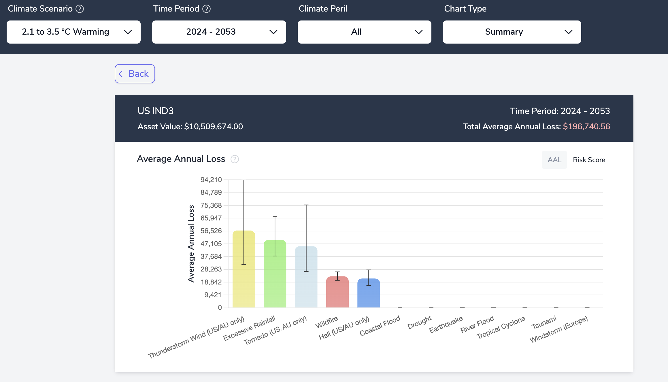
The starting point for viewing assessment result charts is the Summary View. This shows the projected Average Annual Loss (AAL) [Asset Analysis] - with confidence intervals - or Risk Score [Hazard Only] for each peril assessed.
Note: Switch between AAL & Risk Score, when applicable, using the Toggle at the top right of the chart
The confidence intervals for AAL are dependent on the Hazard Model for each peril in a given geography, as well as the Vulnerability Model, which is significantly informed by the asset details entered by the user.
Toggle the Climate Scenario and Time Period Filters at the top of the page to examine how the AAL estimates change under different parameters.
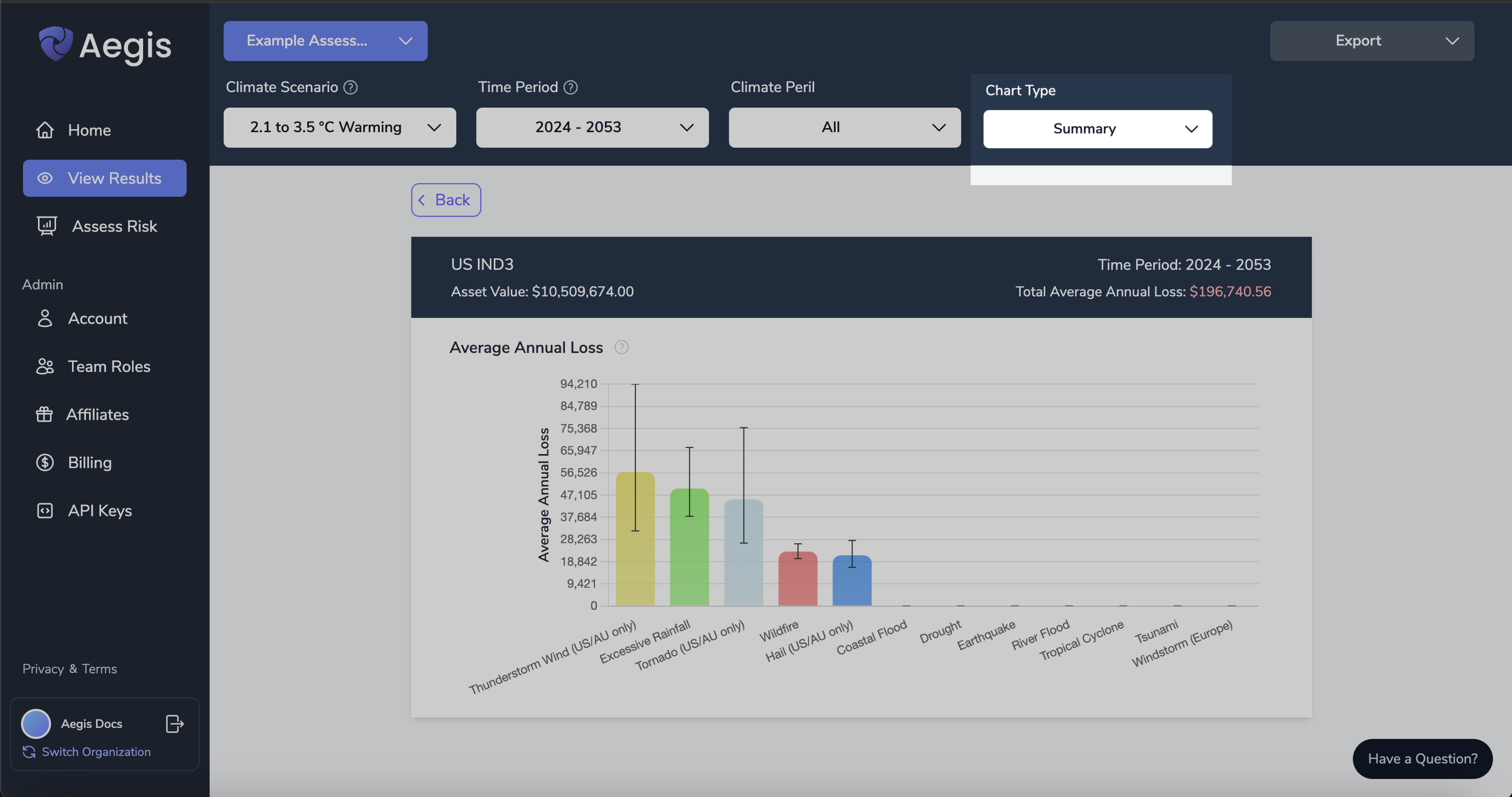
To access all different chart views explained below, use the Chart Type filter in the top navigation bar.
Exceedance/Loss Chart
Navigate to the Exceedance/Loss chart using the “Chart Type” filter at the top of the page
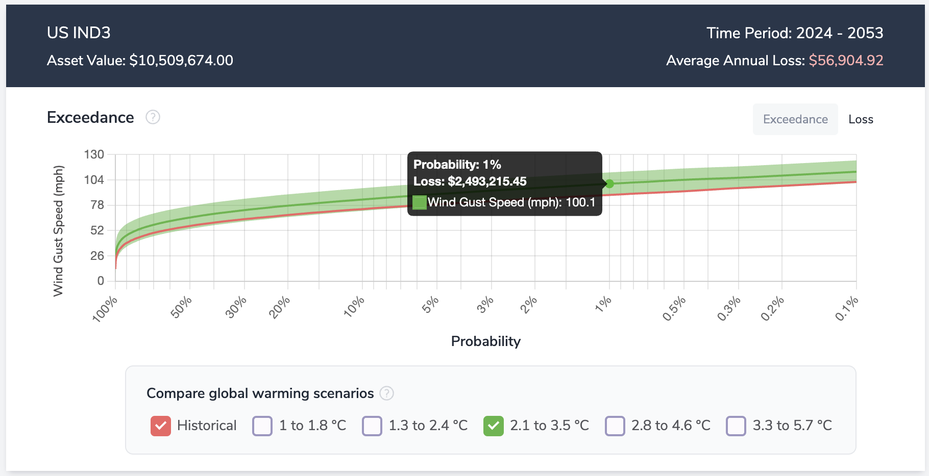
The Exceedance Curve represents the probability of a weather event exceeding a certain magnitude in any given year during the time period being assessed.
The Historical Exceedance Curve and Projected Exceedance Curves for each climate scenario can be toggled on/off using the chart legend below the graph. This feature allows users to evaluate how varying climate scenarios influence event probabilities over time.
Note: The difference between the projected and historical exceedance curves becomes more pronounced when assessing longer time periods.
Example Chart & Interpretation:
As an example, if we look at the Exceedance Curve for the Thunderstorm Wind events in Oklahoma, we see that historically, there was a 1% chance to see a Thunderstorm with winds in excess of 88 mph in any given year, representing a 1-in-100 year event.
However, under Climate Scenario SSP245, which projects a global temperatures increase of 2.1 to 3.5 degrees C by 2100, we see that the same 1-in-100 year event is now a Thunderstorm with winds in excess of 100 mph. This indicates a significant increase in the magnitude of the event.
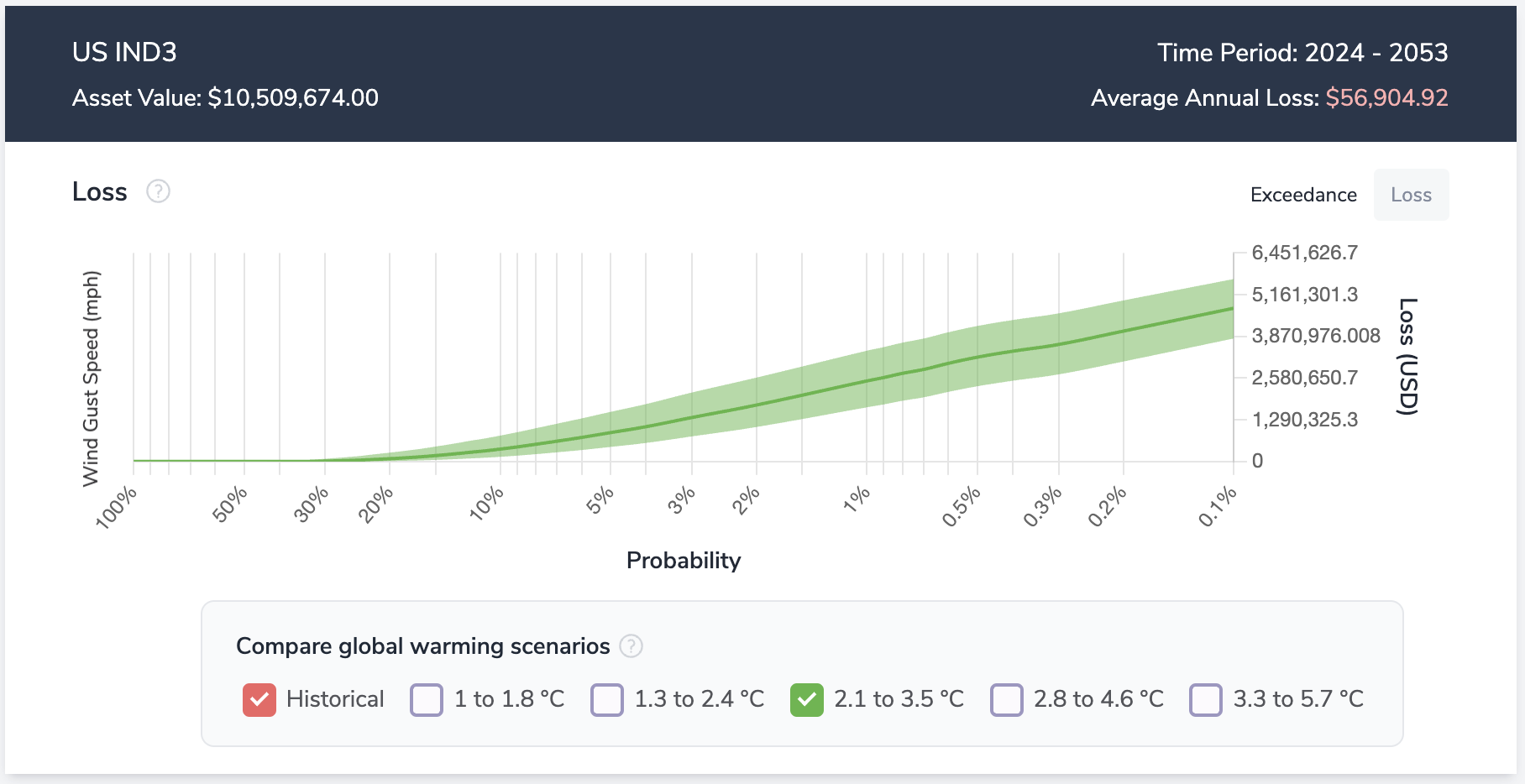
To comprehensively assess your tail risk, switch to the Loss Curve by clicking the button at the top right of the chart.
The Loss Curve illustrates the estimated financial damage associated with varying magnitudes of a given peril.
In this view, users can compare expected losses across different return periods and climate scenarios.
Example Chart & Interpretation:
Similar to the interpretation for the exceedance curve, if we look at the 1% probability point, it indicates a $2,493,215.45 loss for the asset.
Event Frequency Charts
Aegis provides a comprehensive view of past events at the assessed location and projects how event frequency may change under various climate scenarios. This provides fundamental context for interpreting the Exceedance Probabilities, and especially the Average Annual Loss (AAL) estimates.
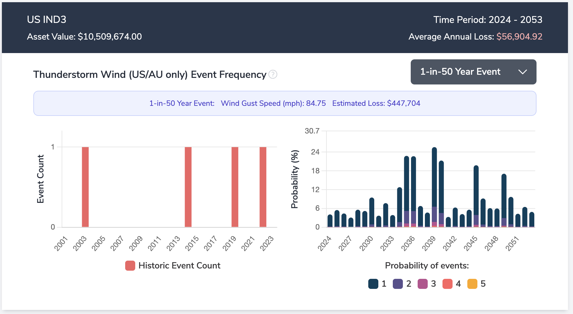
For any selected peril, the “Event Frequency” chart enables users to choose a “Return Period” using the filter at the top right of the chart and displays the corresponding historical event magnitude and estimates the financial loss (damage) associated with such an event for the asset being analyzed.
- Historic Event Count: This chart (shown on the left) details the number of past events that exceeded a specified magnitude at the location.
- Projected Frequency: This chart (shown on the right) illustrates the likelihood of experiencing one or more events surpassing a specified magnitude in each year of the assessment period.
Note: Projected frequency will change depending on the climate scenario selected.
Example Chart & Interpretation:
As shown in this example, under climate scenario SSP245, the projected probability of seeing at least one thunderstorm event with winds in excess of 84 mph is between 3% and 25% for each year during the period assessed - 2024 to 2053 [Right Chart]. Additionally, there have historically been 4 recorded events with winds exceeding 84 mph between the years 2001 to 2023 [Left Chart].
Temperature Related Graphs
Heating Degree Days [HDD]
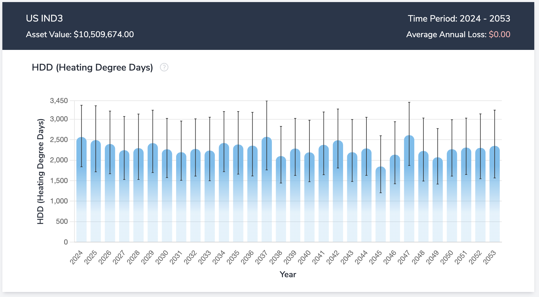
- HDD (Heating Degree Days) is used to measure the energy demand for heating and are calculated as the number of degrees that a day's average temperature is below 65°F.
- For example, if a day's average temperature is 62°F, that equates to 3 HDDs.
Example Chart & Interpretation:
In the chart below, under the SSP245 climate scenario, Aegis projects this location will have 2,234 HDD’s in the year 2033
Cooling Degree Days [CDD]
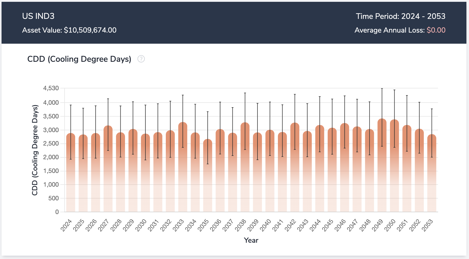
- CDD (Cooling Degree Days) is used to measure the energy demand for cooling and are calculated as the number of degrees that a day's average temperature is above 65°F.
- For example, if a day's average temperature is 68°F, that equates to 3 CDDs.
Example Chart & Interpretation:
In the chart below, under the SSP245 climate scenario, Aegis projects this location will have 3,239 CDD’s in the year 2033
Hazard Only Tiers: Summary (Risk Scores), Exceedance, Event Frequency
Asset Analysis Tiers: Summary (AAL w/ Confidence Intervals), Exceedance & Loss, Event Frequency
Need More Help?
If you have further questions regarding Metrics & Charts, please send us an email at support@dclimate.net.
Also, feel free to submit a question using the 'Have a Question?' button located at the bottom right of the screen on Aegis.